
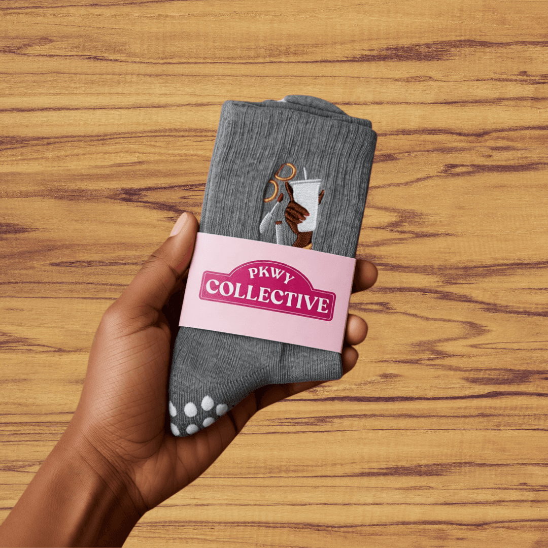
New Drop
PKWY Collective Grip Socks
Melanated & Fair
Made for the sisters (and everybody) who show up as they are. Soft, breathable, with heart-shaped grip on the bottom: culture, community, and control in every step.
$17.99
Brand
Every primitive that powers v2, in one place. Source of truth for tokens, typography, and components.
oklch values defined in lib/branding/theme.ts; exposed as CSS variables.
--brand-pink
--brand-pink-hover
--brand-pink-soft
--brand-indigo
--brand-indigo-hover
--brand-indigo-soft
--surface-0
--shelf
--text-primary
--text-secondary
--text-tertiary
--line-strong
Never embed colors inline. Use the named utilities (bg-indigo, text-pink) so theme swaps Just Work.
Component-ready class strings from lib/branding/styles.ts. Use these, not raw text-[NNpx].
When to use each scale: hDisplay / hPage — hero headlines only; hTitle — major section dividers; hSection — subsection headers; hHeading — card / block titles; hSub — small stat values; tLede — the opening paragraph; tBody — body copy (most common); tMeta — captions, dates, hints; tQuote — rare pull quotes. Never reach for a raw text-[NNpx].
components/primitives.tsx · Button + bespoke pills.
Always reach for <Button> first — it handles links (href), form submits (type/formAction), onClick, and a loading state, so there is no standalone button class to drift from. Pick the variant by emphasis: primary (animated cotton-candy gradient) for the one dominant CTA on a surface; solid for everyday actions (form submit, dialog confirm, add-to-bag); outline for the secondary next to a primary; ghostfor low-emphasis / icon-adjacent actions. Hand-roll a button only for a genuine one-off the variants can't express (e.g. the pink pill below).
components/primitives.tsx · Eyebrow.
Default
tertiary tonePink
brand pinkIndigo
brand indigocomponents/form.tsx · Field + TextInput / Textarea / Select / Checkbox / FormError.
Form-level error message.
components/dialog.tsx · Dialog + DialogHeader / DialogBody / DialogFooter / DialogCancel.
Backed by native <dialog> with animated entry, autofocus, backdrop click-to-close. Use data-autofocus on a child to override the first-focusable default.
components/primitives.tsx · SurfaceCard.
pad=sm · round=md
pad=md · round=lg
pad=lg · round=xl
components/primitives.tsx · Section / Shell.
<Section pad="lg|md|sm" shelf bordered width="sm|md|lg|xl"> wraps everything in a centered <Shell>. Use shelf for the soft pink background, bordered for the hairline top border. Padding ladders:
components/product-card.tsx · used in /shop.
New Drop
Melanated & Fair
Made for the sisters (and everybody) who show up as they are. Soft, breathable, with heart-shaped grip on the bottom: culture, community, and control in every step.
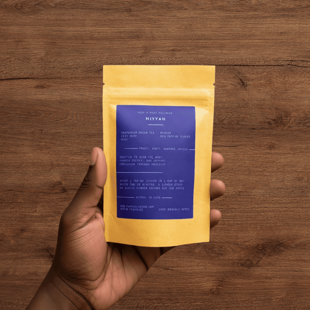
Health
100% organic herbs
A gunpowder green tea blend crafted to warm the body, awaken energy, and support endurance through movement. Approx. 30 cups per bag.
components/value-card.tsx · the 3-up trust block used on /, /about, /shop.
Every product is personally tested by our instructors.
We are a Pittsburgh studio, not a warehouse.
Chosen to support practice and recovery.
components/pill.tsx · order + transaction statuses in the staff portal.
Used in /staff/settings stock toggles.
Reach for these before writing new markup.
Layout · primitives.tsx
Actions · primitives.tsx
Forms · form.tsx
Shared blocks
Conventions enforced across the codebase.
bg-indigo, text-pink, border-line-2
bg-[var(--brand-indigo)], text-[#5a4fcf]
styles.hHeading, styles.tBody
text-[28px], tracking-[-0.01em]
<div className="flex flex-col gap-4">
mb-4 on every child
<section aria-label="Stats">
— · use comma / period / colon / restructure